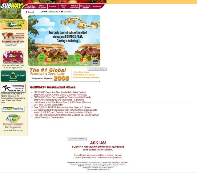

This is the Subway sandwich company website. in this website it containthe information about the company and all the product benifit and so on.this website used a very basic navigation system and actually it isn't a very good work. this website actually wasted a lot of space which it isn't nesasary.
1 comment:
Personally I think Subway website is more towards an informative website. Although it is a corporate website, it still can be more fun and interactive to bring out the idea of healthy and nutritious food. Now it looks like a wholesale food factory website to me...
It is good to be detail, but for your grid system draw out, I say it is too detail. Try to see thing in a simple way. For me I will only split it into:
1. Logo
2. Header
3. Main Navigation
4. Path
5. Links
6. Content
7. Footer
Please remember that grid system is just a "guideline" for your slicing, not the actual slicing. The reason why we need to find out the grid is to do your slicing in a sampler and easier way.
Anyhow, good job!
Best regards,
Yik Jian
Post a Comment