Monday, September 24, 2007

http://www.playwithus.co.uk/awards/myamoy/welcome.html


This is a web side that combine a film and computer graphic. This is a website that let you create your own dishes and send it to the competition. This competition is held by Ajinomoto, a company that well know to the world of its seasoning.
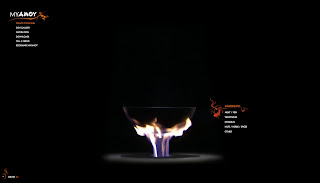
What attracts me from this website is its way to present it. We seldom saw recipe competition through the net, but here it is, the 1st (To me lah~) recipe competition on the net that present like this.When you click on the ingredient from the selection, the real thing appears on the screen and will be put into the ‘kuali’ and cook it in the fire. And the main focus user will focus will defiantly be the fire and the ‘kuali’.
The navigation bar on the top left
Also have the fiery colour of orange and make the web had the warm hot feeling that the user were in the kitchen or somewhere near the fire.

http://www.drawingart.org/#/home


Darwingart is a web design company that create much well known company’s website. The first time I visit this website it only gives me an impression, Ahhhh…. . May be it’s the colour, maybe it’s the music. Everything seems just nice together. It was a simple yet elegant, cool yet relaxing feeling. I LIKE IT!! This is what I can say to this website.
The colour and the combination of the music makes the whole website felt very relaxing and makes viewer like to stay in this site and view the entire sub site.
Beside that, the navigation button are also very user friendly. Not only had they had the basic navigation button on the bottom of the page, but also that secondary button such as the sound, background colour and news letter button appears on the left and right of the screen. This makes the whole page seems neat and clear and also user friendly.

http://onehour.jp


This is a Toshiba webpage from Japan. The designer tries to use a new way to navigate through out the web site, which user can control the animation itself. User goes to different pages by moving the mouse to different direction and also by using the scroll on the mouse to move to other pages too.


It is a very unusual way to navigate and I think the designer done a great job on this website.
But sadly, this type of navigation may cause a lot of headache too many people.I personally like the design but not the way it navigates. It’s very confusing and the background music sound effect makes it worse. The only things I do on this web site were play with the effect for a few minutes and close the window without viewing on any of the information. This is due to the way it navigate that make me fed up with

http://www.michelinman.com/forward/


This website belongs to the Michelin tyres company. In this website they promoted their product by bringing user into the Michelin man (aka Bibendum) world. The designer created this world of Bibendum that produce quality tyres and high tech machineries that only appears in this virtual world.
The graphic and animation looks wonderful and it also had a lot of interesting transaction to bring us from place to place.
The overall webpage is like a tour of the factory and it will let us choose where to go. It’s a very enjoyable tour for me.
The information they put in it is very educational and makes us know the technology behind the tyre.
The only down site is that it took too much time loading and not everyone will have high internet speed to view it smoothly.

www.feta.pl/


This is the official website of the International Street and Open-air Theatre Festival FETA.

It is a very interesting website that fully used the arrow key on the key board to navigate

through out the whole website. Whenever you use your mouse to click on any buttons, another

page will slide out and tell you that it’s an arrow navigating website and also tell you that which

arrow will bring you to which sub page and how to navigate it.


It’s kind of cool cause there isn’t a lot of webpage that give us the chance to navigate by using the keyboard only, and it’s kind of unique in it’s own way. The web site don’t have much

information in it but the way they present it makes it seems good enough to being present.


This web page used a horizontal style whereby the pages are being arranged in to a very long

horizontal view. Whenever we want to go into a sub page, we’ll just need to press down on the

arrow key. This will make the user recognised and it will be very easy to navigate.