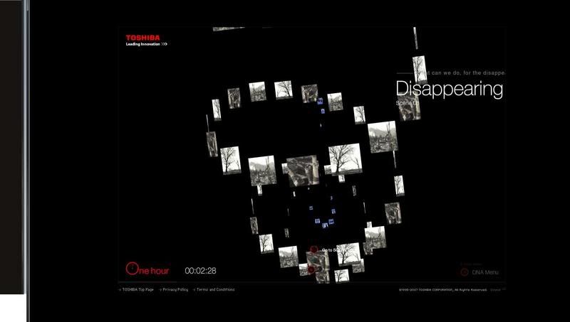
This is a Toshiba webpage from Japan. The designer tries to use a new way to navigate through out the web site, which user can control the animation itself. User goes to different pages by moving the mouse to different direction and also by using the scroll on the mouse to move to other pages too.
It is a very unusual way to navigate and I think the designer done a great job on this website.
But sadly, this type of navigation may cause a lot of headache too many people.I personally like the design but not the way it navigates. It’s very confusing and the background music sound effect makes it worse. The only things I do on this web site were play with the effect for a few minutes and close the window without viewing on any of the information. This is due to the way it navigate that make me fed up with
1 comment:
First, the language choices are good, due to the worldwide brand. The website is quite interactive, we can play with our mouse scrolling and so on.
As you said, it's really interesting that we can scroll to the next scene, so it don't look boring as usual. We can also control the speed and the angle as well.
The bad thing is there isn't any main navigation to make the user more convenient. If for some businessman, they will prefer to save more time and will not want to explore around.
Some of the things are interactive but will confuse me to click on it when actually the buttons is not clikable.
The bg music is quite disturbing and a bit noisy for me, too. I'm not enjoying the bg music actually. Why don't they use some soft and relaxing music which can also bring out the mood of their brand, I know it's hard.XD
Post a Comment