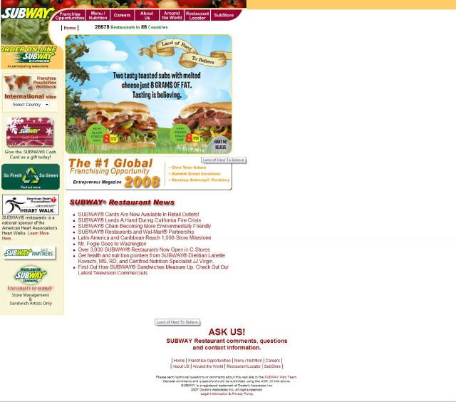
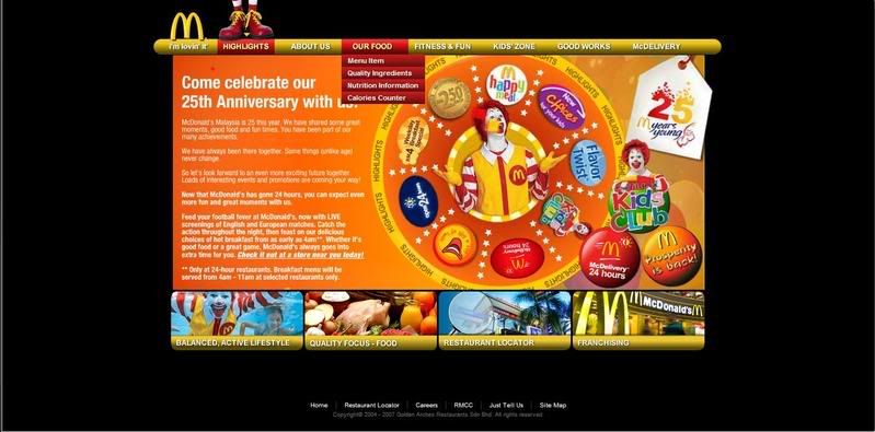
Baskin Robbins (http://www.baskinrobbins.com.my/) is the company that I was chosen to redesign it’s cooperate website. From what I research on, the 3 main competitor of Baskin Robbins (BR) is Lecka- Lecka (http://www.leckalecka.com.my/), Haagen-Dazs (http://www.haagen-dazs.com/), and New Zealand Natural (http://www.newzealandnatural.com/). Each competitor got its own strength
Since Burt Baskin and Irv Robbins first came up with the idea of having one flavour for every day of the month in a single ice cream store, Baskin-Robbins has led the frozen dessert industry with delicious desserts and innovation. Today, Baskin-Robbins is best known for its 2,500 stores operating in U.S.A and 2,500 stores outside U.S.A. But what is not commonly known is that Baskin-Robbins is a leader in flavouring innovation and development. With over 58 years of experience in delivering frozen product and are unique in the frozen dessert world.Baskin-Robbins is one of the most widely known and respected brands in the U.S. today. In fact, 97% of the American public recognizes the Baskin-Robbins name.
Baskin-Robbins offers over 1,000 flavours of ice cream, including Sugar Free, Fat Free and Light. Our menu also includes frozen yogurt, sorbets, sherbets, beverages, cakes, sundaes and handpacked for every occasion. And they are just as innovative about the places and the ways we serve these fine products to their customers.
Their primary objective is to make each and every visit to Baskin-Robbins memorable and deliciously fun. They intend to stay “Malaysian’s Favourite Premium Ice Cream” in every way.
Baskin Robbins is all about fun and happiness; they always try to bring joy to everyone through their ice cream. That’s why in the new Baskin Robbins Website, I intended to put in more fun element such as games, more flash, more interactive, and some freebies for those who join the online membership and also those who explore through out the website.
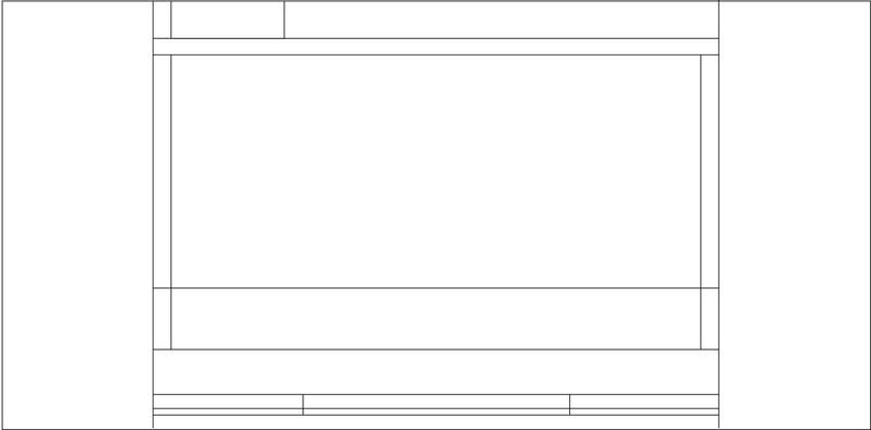
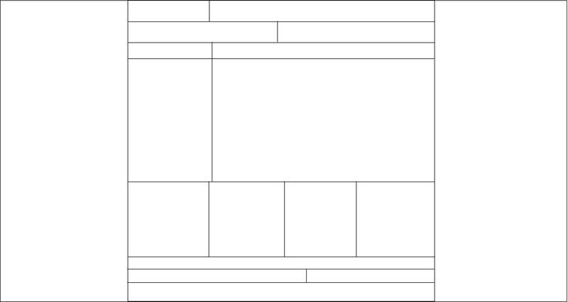
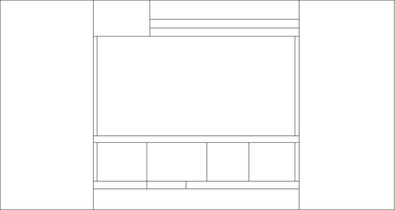
Besides that, I’ll also separate out the website into two type of style. One is more to the fun flash product and event part which will have more flash and interactive. The other one will be the history, nutritious and franchise info part which is more towards the static type of website.
Because of the primary target audience will be kids below 12 years old, this website will emphasise more on the fun and interesting flash and also creating a more straight forward website where the secondary target audience which is those parents which have child below 12 years old, to gain useful information on the brand it self.
The new Baskin Robbins web site’s colour will base on the identity colour of the company it self which is pink blue black and white. It will also try to put more element of the brand it self such as the pink little spoon to decorate the website with.
Since Burt Baskin and Irv Robbins first came up with the idea of having one flavour for every day of the month in a single ice cream store, Baskin-Robbins has led the frozen dessert industry with delicious desserts and innovation. Today, Baskin-Robbins is best known for its 2,500 stores operating in U.S.A and 2,500 stores outside U.S.A. But what is not commonly known is that Baskin-Robbins is a leader in flavouring innovation and development. With over 58 years of experience in delivering frozen product and are unique in the frozen dessert world.Baskin-Robbins is one of the most widely known and respected brands in the U.S. today. In fact, 97% of the American public recognizes the Baskin-Robbins name.
Baskin-Robbins offers over 1,000 flavours of ice cream, including Sugar Free, Fat Free and Light. Our menu also includes frozen yogurt, sorbets, sherbets, beverages, cakes, sundaes and handpacked for every occasion. And they are just as innovative about the places and the ways we serve these fine products to their customers.
Their primary objective is to make each and every visit to Baskin-Robbins memorable and deliciously fun. They intend to stay “Malaysian’s Favourite Premium Ice Cream” in every way.
Baskin Robbins is all about fun and happiness; they always try to bring joy to everyone through their ice cream. That’s why in the new Baskin Robbins Website, I intended to put in more fun element such as games, more flash, more interactive, and some freebies for those who join the online membership and also those who explore through out the website.
Besides that, I’ll also separate out the website into two type of style. One is more to the fun flash product and event part which will have more flash and interactive. The other one will be the history, nutritious and franchise info part which is more towards the static type of website.
Because of the primary target audience will be kids below 12 years old, this website will emphasise more on the fun and interesting flash and also creating a more straight forward website where the secondary target audience which is those parents which have child below 12 years old, to gain useful information on the brand it self.
The new Baskin Robbins web site’s colour will base on the identity colour of the company it self which is pink blue black and white. It will also try to put more element of the brand it self such as the pink little spoon to decorate the website with.